As always, these are just my personal opinion. These City Connect jerseys have fluctuated greatly as more and more get released. Which jersey is your favorite? Let me know in the replies at the bottom of this post!
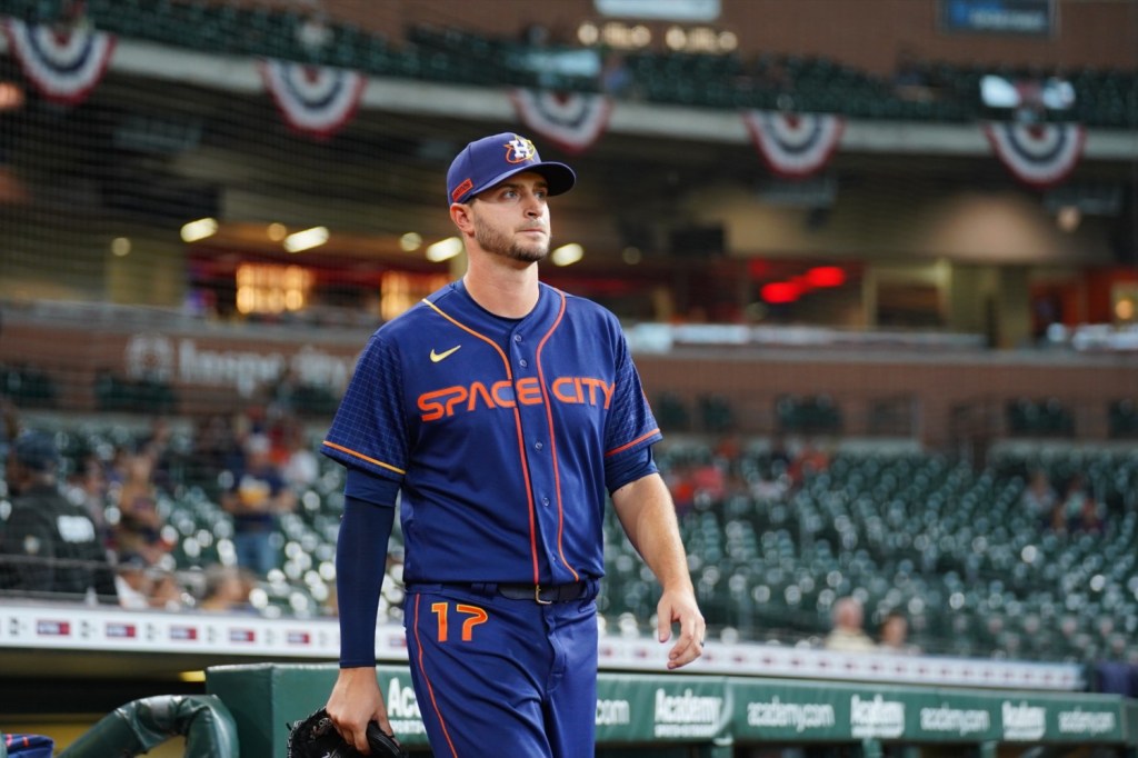
20th: Houston Astros
These certainly aren’t the worst jerseys ever created. They’re just the worst of the City Connects. A+ for creativity. The execution just isn’t quite there. Also, no one looks good in these threads.
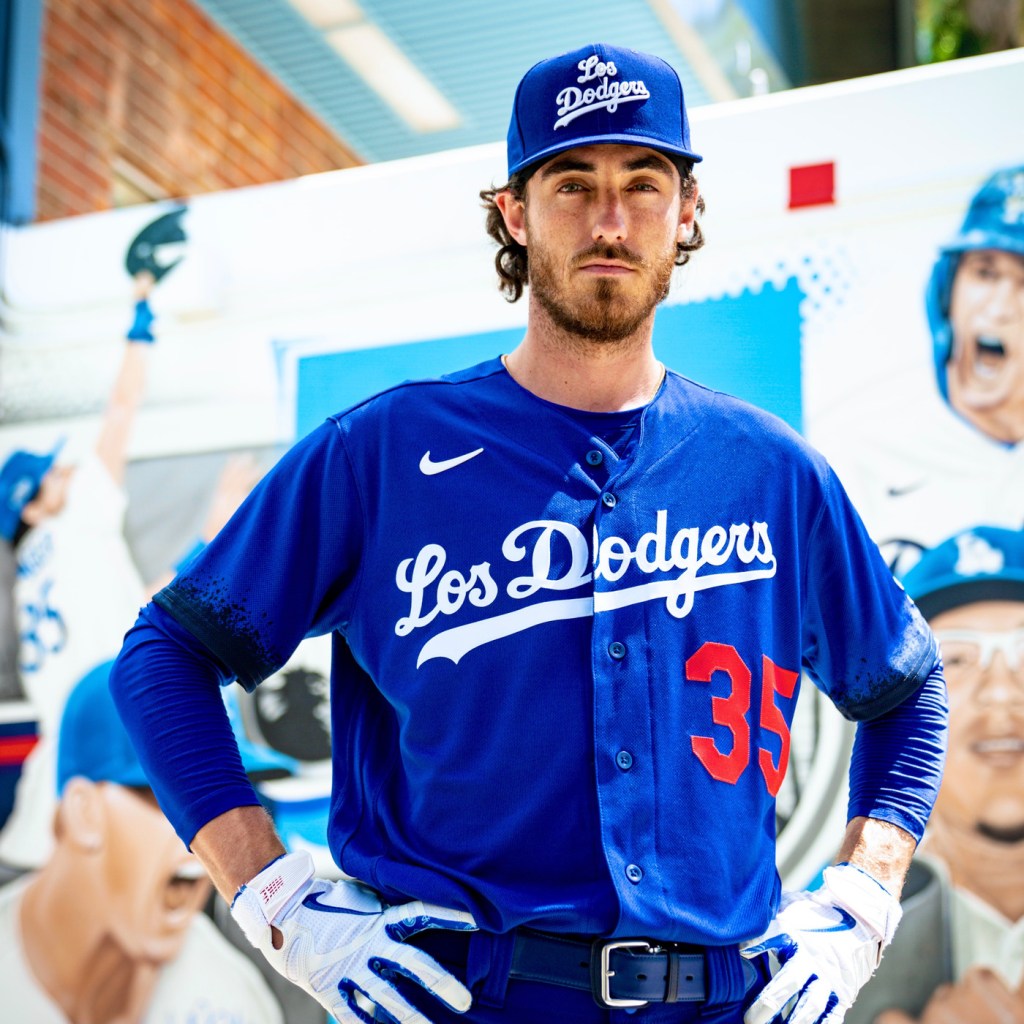
19th: Los Angeles Dodgers
Either the Dodgers weren’t really trying, didn’t really care, or weren’t given very good instruction as to what City Connect jerseys are supposed to be. Respect to the Dodgers for attempting to represent their massive Hispanic fanbase, but these suck. The biggest issue is the lack of diversion from what their normal jerseys look like, a problem that many teams on this list should wish they had.
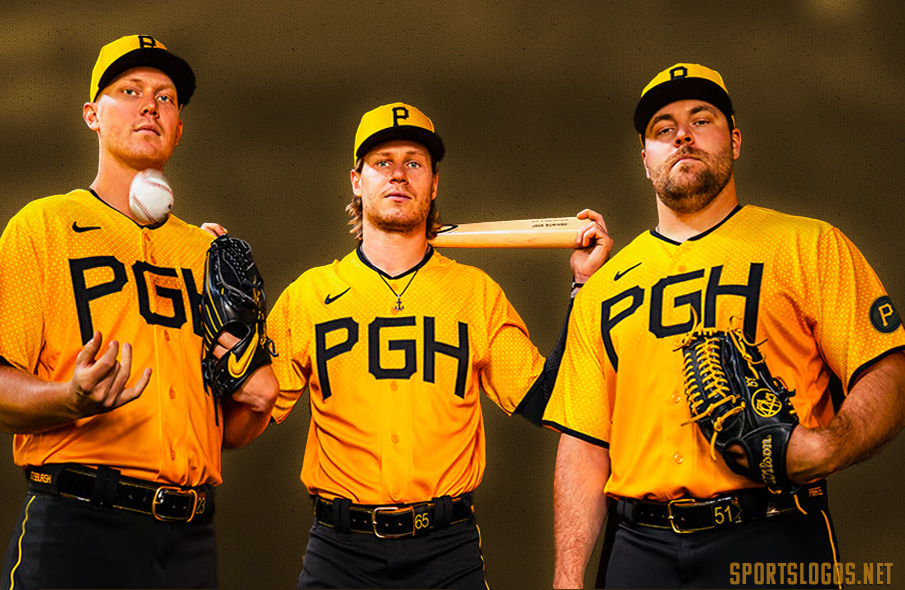
18th: Pittsburgh Pirates
Truth be told, these are overhated. They’re not the worst jerseys that have been released. I think the biggest issue is the decision to wear black pants. It seems like nearly every team decided to go the black pants route and it hasn’t really worked for many of them. What upsets me most is the fact that Pittsburgh had so many avenues to design a cool jersey. The Roberto Clemente bridge or embracing the actual Pirate mascot in a bigger way could’ve been awesome. Unfortunately, we’re left with yellow threads and three bold letters. Hey every city that’s not Atlanta, stop trying to make a three letter thing catch on.

17th: San Francisco Giants
These look like jerseys some travel ball team orders when you’re in the eighth grade. They’ve received plenty of hate from baseball fans, and a not-so-warm reception upon their release. I’d still rather wear them over the first three jerseys mentioned, but they’re pretty lame either way. At least the Giants play good in them! I’m not sure if the jerseys are actually bad or if the Giants normal threads are so good that it ruins these.

16th: Milwaukee Brewers
These have grown on me quite a bit since their release. They’re still towards the bottom of my list because of how lame the hat is. Baseball hats haven’t ever really had big bold text across the entire face of the hat, and for good reason. The giant MKE feels so cheap. Still unsure why they didn’t attempt to incorporate some sort of subtle beer related theme.
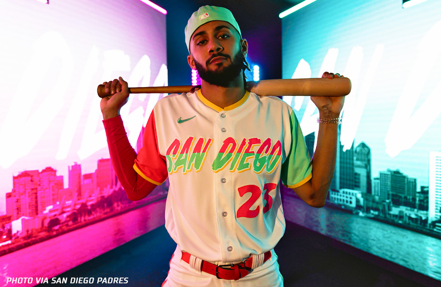
15th: San Diego Padres
Similar to the Giants threads, these seem like something middle school me would have died for. These definitely miss the mark from a coolness standpoint. But they do try to “connect with the city” (as is the purpose of these jerseys) better than some.

14th: Seattle Mariners
These Mariners jerseys aren’t that bad. I actually think they’re pretty cool. There’s only one issue with them: they’re the least cool jerseys the Mariners have in rotation. They basically already wear this jersey scheme but in a much cooler cream jersey. It doesn’t connect with the city like it could have but the Mount Rainier patch is a nice touch. The black pants hold these back once again.
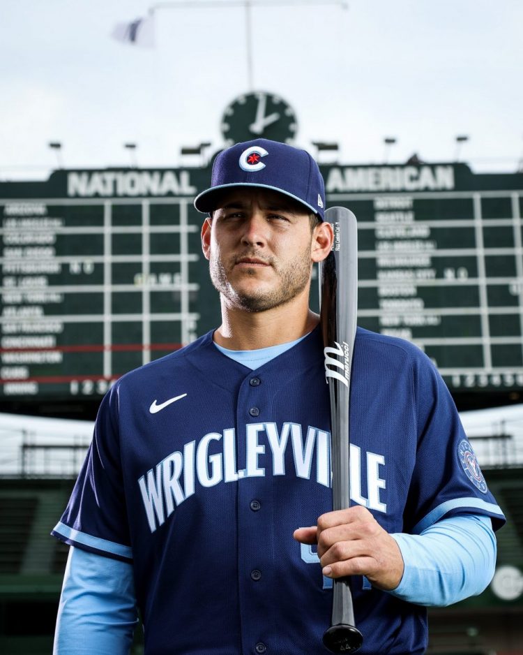
13th: Chicago Cubs
These cubs threads start the next segment of this list: jerseys that don’t suck. The Cubs would be way higher on this list had they chosen to wear these blue threads with normal pants instead of dark navy. Seriously, what’s up with all the dark pants? At least they’re not black pants like everyone else.
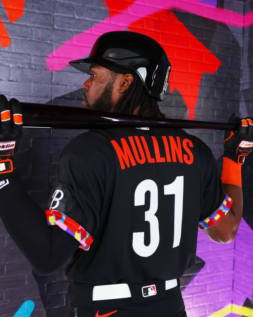
12th: Baltimore Orioles
These are one of the few jerseys that actually make the black pants work. They’re simple without being the Pirates. They’ve got some nice details and non-color scheme pop without being the Padres. It’s not the craziest design but it’s pretty good!
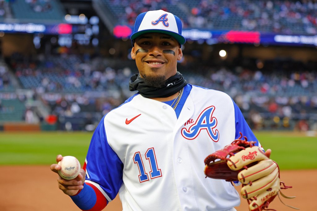
11th: Atlanta Braves
Maybe I should have ranked these lower for the lack of any creativity whatsoever. They’ve been wearing these same jerseys for like eighty years. All they did here was add the word “The” before the A. But as it goes, if it ain’t broke, don’t fix it. They’re very good looking jerseys and have been a fan favorite design for decades for that reason.
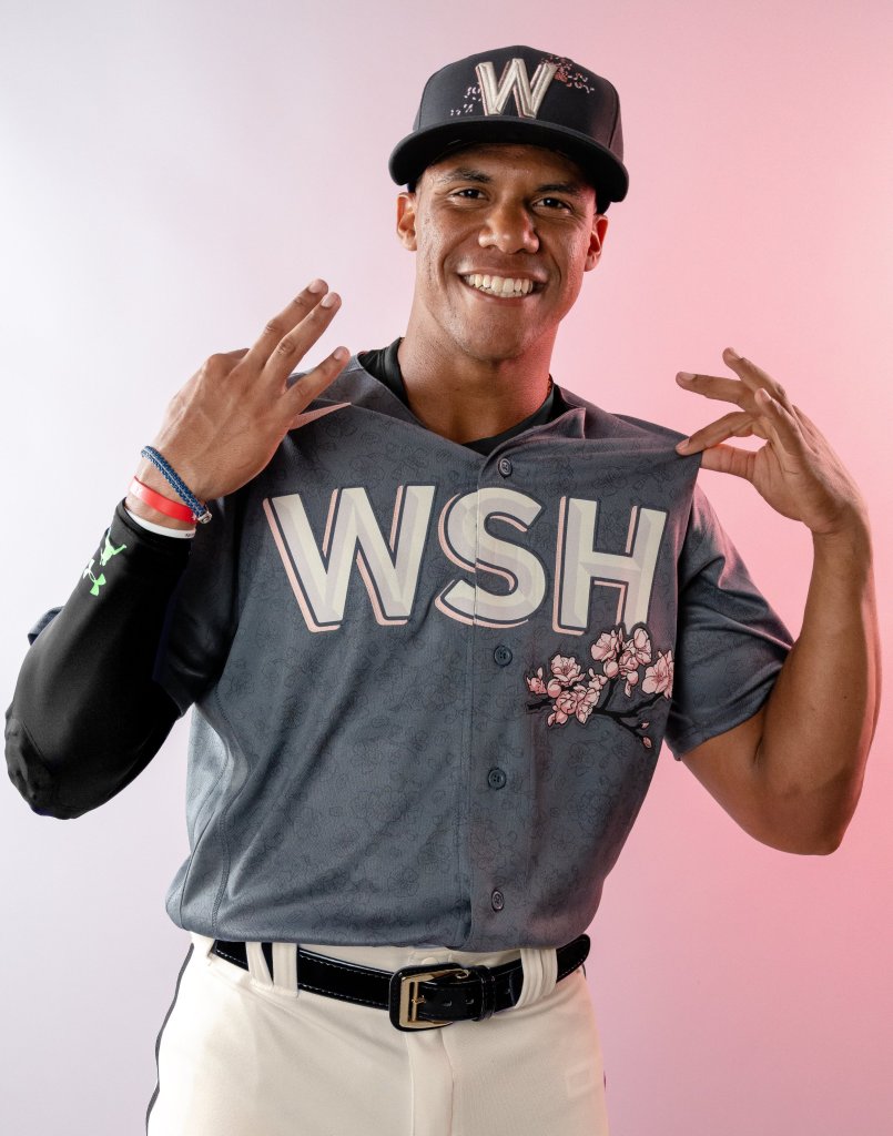
10th: Washington Nationals
These are a chef’s kiss to what City Connect jerseys are supposed to be. They give D.C. a subtle nod by switching up the loud red for a soft pink to symbolize the city’s cherry blossoms. The hat could’ve used a little bit more thought and these honestly could’ve been higher on the list if the Nationals had a single player to watch wear them. A soft quiet jersey doesn’t pair well with a terribly boring team.
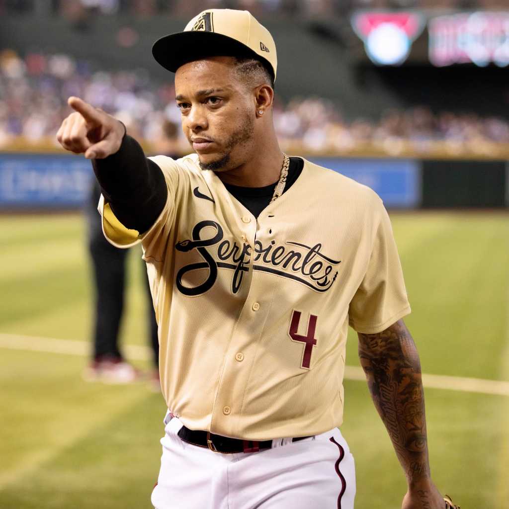
9th: Arizona Diamondbacks
These are another example of a jersey that can be way cooler when not worn with wacky colored pants. The Dbacks tan color way is very clean and is executed well. The only qualm I have is the matching pants they wear. Also don’t love that they didn’t develop some type of new logo for the hat.

8th: Kansas City Royals
These jerseys are awesome. The Royals did everything perfectly. The letters dripping like the fountains in the outfield, the perfect use of baby blue with the navy, it’s all perfect.
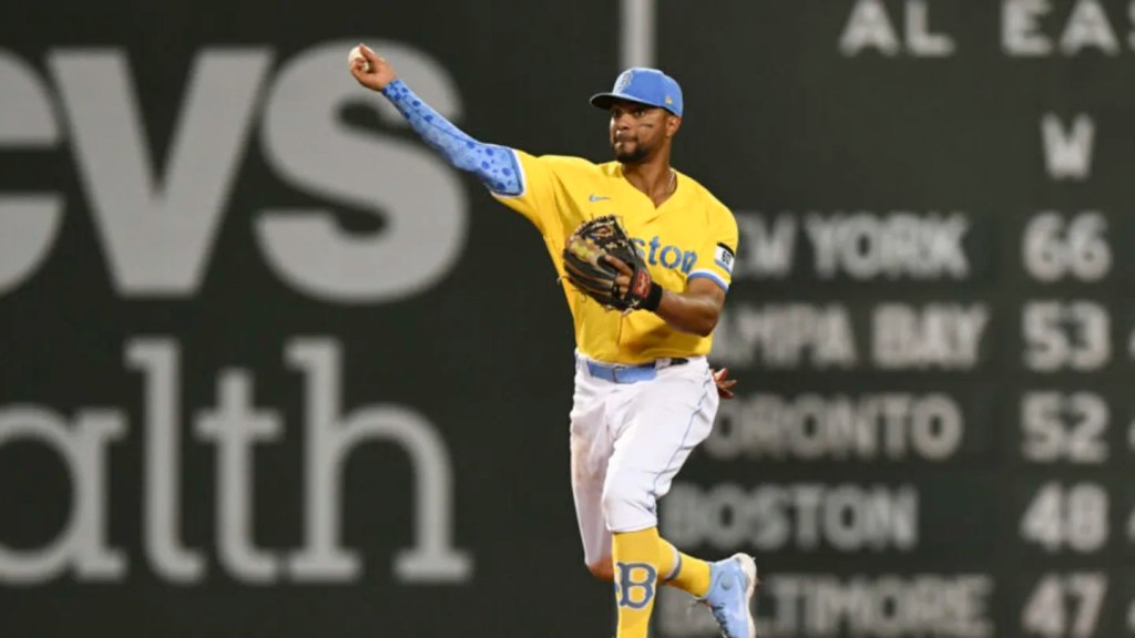
7th: Boston Red Sox
If any other team released these jerseys they would be far lower on this list. Fortunately, the Red Sox released these threads which tie into their city’s roots extremely well. Props to you for not wearing black pants, Boston.

6th: Colorado Rockies
As a Rockies fan, I was overjoyed to see something new that wasn’t their traditional purple pinstripes. Since their release, these jerseys have been an extremely big hit with Rockies fans and non-Rockies fans alike. These probably “connect with the city” better than any jersey that’s been released thus far. Incorporating the literal Rockies, the ski patch, and utilizing the Colorado license plate all worked very well. The only kicker is the green pants. The Rockies have ditched them for white ones on numerous occasions and when they do, few jerseys are cleaner.

5th: Texas Rangers
The Rangers may be the only team to use the dark pants well. Their jerseys are a kind of timeless that I wish was in their everyday jersey rotation. The little demon-dragon-bird on the side ties the beautiful font on the chest together well. The white belts are a nice little plus too.
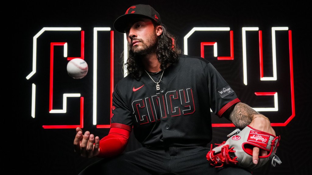
4th: Cincinnati Reds
Cincy did everything right here. They utilized an all black look in a way that doesn’t look overly cheesy and developed a new logo which is huge in designing an awesome city connect jersey.
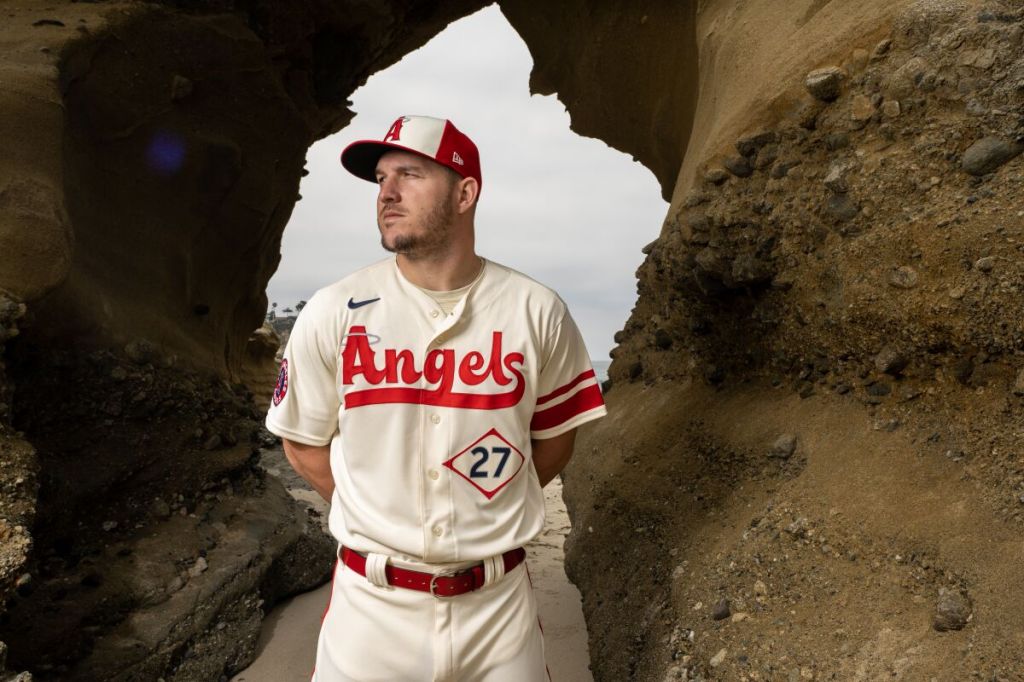
3rd: Los Angeles Angels
At this point, the jerseys are perfect. It’s a matter of just picking one. The next to uniforms have little more flair and are slightly bigger risks for the teams who designed them. These are fantastic however, I only wish we could see the Angels win some games in them. The only thing keeping these out of the first place spot is how good the next two jerseys are.
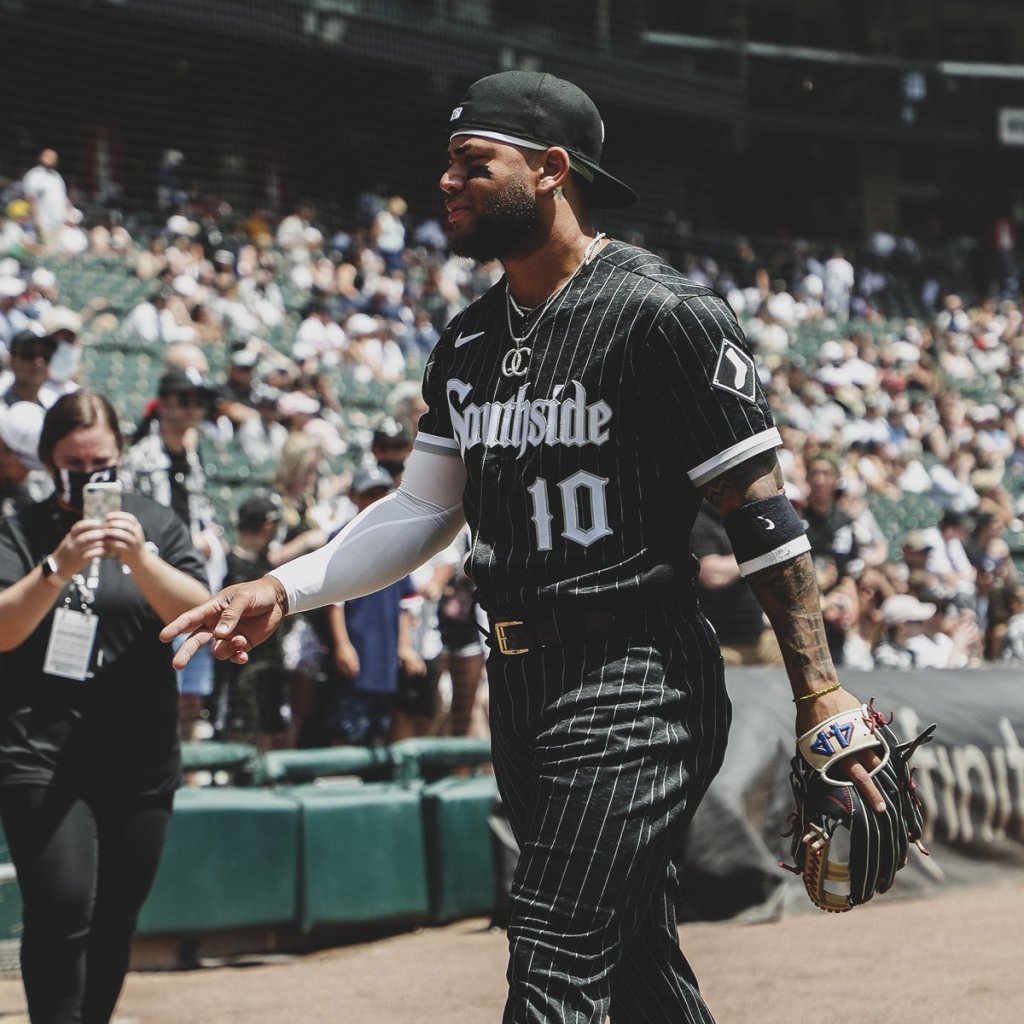
2nd: Chicago White Sox
The Sox play in the most dangerous stadium in baseball to attend. Playing baseball on the south side of Chicago makes less sense each year and it seems like the White Sox are always playing with a chip on their shoulder. This is portrayed in a “bad boys” jersey that is timeless. The only thing keeping this from being number one is how little it deviates from their traditional threads.

1st: Miami Marlins
These jerseys couldn’t have been done better. The homage to the Sugar Kings of Havana, Cuba. The contrasting red and blue. The flashy Miami feel. These jerseys somehow just feel like a cocaine dealers wardrobe in a Miami based feature film. Perfecto Miami.

Leave a comment